gnuplot is an excellent scientific package for visualizing data and plotting functions. Despite its name, it has nothing to do with the GNU project, even though it’s Open Source and entirely free. This tool is very handy whenever you need to produce production quality graphics from a given data-set (or function). It is no wonder that in its 20+ years of existence, it’s been employed in all sorts of industries.
Flexible, powerful, and easy to use, gnuplot is not only handy as a stand-alone program but can be used successfully by a variety of programming languages, including but not limited to Ruby, Python and Perl. It has also been adopted as a plotting engine by Open Source programs like Maxima and GNU Octave. The minimal effort required to learn gnuplot is therefore a very worthwhile endeavor. Being able to visualize things as you analyze data and explore mathematics, is a very useful aid.
gnuplot is cross-platform, and you can download it from SourceForge.
Once you have installed gnuplot, you can start the tool by simply running gnuplot from the shell. Getting started with the program is straightforward, given that the most basic functionalities are fairly intuitive. For example, if you wanted to plot the sin(x) function, you could run:
gnuplot> plot sin(x)
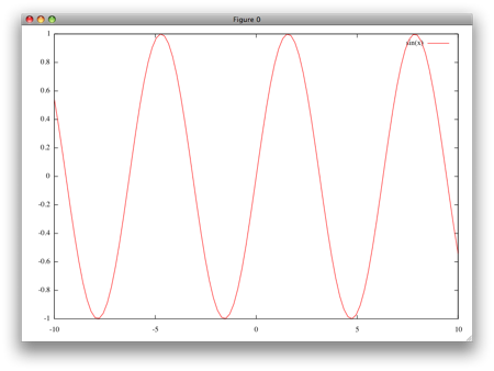
gnuplot will automatically decide for you what portions of the function should be visualized (in our case between -10 and 10 on the x axis). If you want to overwrite this, you can specify otherwise, as shown below:
gnuplot> plot [-pi:pi] sin(x)

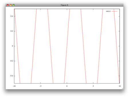
Similarly, you can customize the plotting, by specifying a range on the y axis:
gnuplot> plot [] [-0.5:0.5] sin(x)
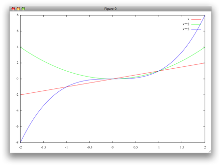
It is also possible to plot several functions at once:
gnuplot> plot [-2:2] x, x**2, x**3
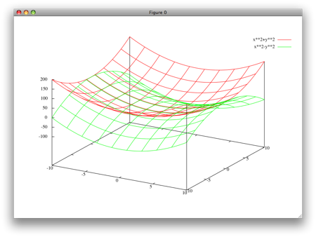
gnuplot can draw all sorts of functions and graphics. For example, the following plots two surfaces:
gnuplot> splot x**2+y**2, x**2-y**2
What you see plotted above, is based on a sensible set of defaults, but gnuplot offers countless options to customize the appearance of your graphics.
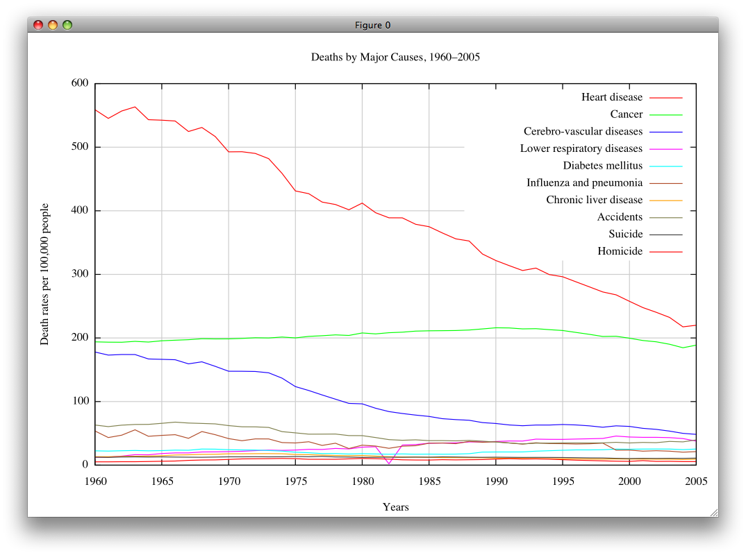
gnuplot isn’t just useful for plotting mathematical functions. I often use it for plotting data that is stored in tabular format in simple text formats. For example, assume that you have collected the following data on Deaths by Major Causes in the US, from a website:
stats.txt
That’s a big chunk of data, but it’s not very easy to analyze. It’d be nice to be able to visualize it. Assuming you saved it in a stats.txt file (you can include or remove the first few lines of comments) from gnuplot you can run the following:
gnuplot> plot "stats.txt"
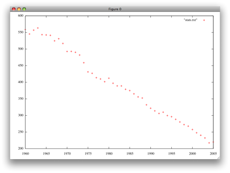
That’s a meaningless mess. But gnuplot is very flexible, so we can easily do much better. Let’s use the first column for x values, and each of the remaining columns as a curve of its own by running:
gnuplot> plot "stats.txt" using 1:2 title "Heart disease" with lines, "stats.txt" using 1:3 title "Cancer" with lines, "stats.txt" using 1:4 title "Cerebro-vascular diseases" with lines, "stats.txt" using 1:5 title "Lower respiratory diseases" with lines, "stats.txt" using 1:6 title "Diabetes mellitus" with lines, "stats.txt" using 1:7 title "Influenza and pneumonia" with lines, "stats.txt" using 1:8 title "Chronic liver disease" with lines, "stats.txt" using 1:9 title "Accidents" with lines, "stats.txt" using 1:10 title "Suicide" with lines, "stats.txt" using 1:11 title "Homicide" with lines
Or it’s abbreviated version:
gnuplot> plot "stats.txt" u 1:2 title "Heart disease" w l, "" u 1:3 title "Cancer" w l, "" u 1:4 title "Cerebro-vascular diseases" w l, "" u 1:5 title "Lower respiratory diseases" w l, "" u 1:6 title "Diabetes mellitus" w l, "" u 1:7 title "Influenza and pneumonia" w l, "" u 1:8 title "Chronic liver disease" w l, "" u 1:9 title "Accidents" w l, "" u 1:10 title "Suicide" w l, "" u 1:11 title "Homicide" w l
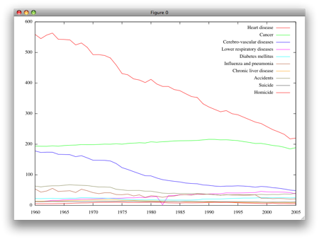
Much better! Of course, the command above has a bit of repetition in it, but it’s justified by the flexibility of being able to pull data from different files if required, and plot some data with lines and others without (or in different styles) if we want to. To improve the appearance and legibility of the chart, let’s add a grid:
gnuplot> set grid
gnuplot> replot
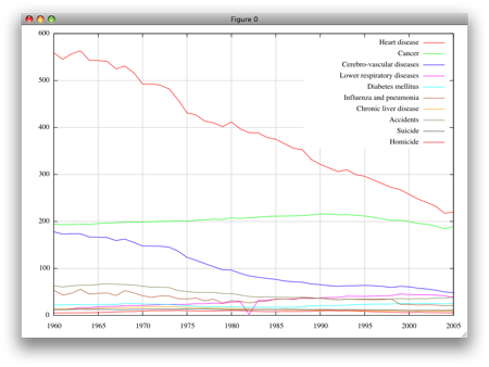
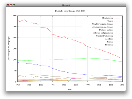
Nice! And notice how the replot command runs the last plotting directive for us, saving us some typing (or scrolling through the previous commands). To improve this further, we can also set the labels for the axis and a title for the whole chart:
gnuplot> set xlabel "Years"
gnuplot> set ylabel "Death rates per 100,000 people"
gnuplot> set title "Deaths by Major Causes, 1960–2005"
gnuplot> replot
(Click here for a larger version)
Effortlessly, we went from having some data in a text file, to a meaningful, and professional looking chart that could be used in an article or a book. Not bad. You can save it in your favorite format, by setting the output file name and the terminal type. In the example below, I specify the font type, size and its location on my Mac OS X system, but it’s entirely optional. If missing, the default fonts apply.
gnuplot> set output "mychart.png"
gnuplot> set terminal png font "/Library/Fonts/Times New Roman.ttf, 11"
gnuplot> replot
This very short introduction should you give you a glimpse into what gnuplot can do for you, and even get you started with the tool. But gnuplot is much more than this and infinitely customizable, so you really may want to consider learning more about it. Unfortunately, despite being widely used for more than a decade, gnuplot has never had a book published about it.
 Thankfully, Manning Publications will be putting out a book called Gnuplot in Action in October. The good news is that you don’t have to wait for the dead tree version, you can purchase it today through the Manning Early Access Program (MEAP). 12 out of the 15 chapters are already available, so the book is pretty much complete. If you’re interested in making the best out of gnuplot, this book is a must have. You don’t have to be a mathematician or a programmer to follow along, and it’s so much more than a bunch of options for customizing your graphics. The book guides you through the best techniques for taking advantage of the tool in several common scenarios. By reading, this easy to follow book, you’ll be able to generate colorful, nifty plots and have good mastery of the tool in a very short amount of time.
Hi, its great to see a good blog on mathematics. Just to tell you I enjoy reading this blog alot.
Is there a simple way to download and install this program on a Windows XP system?
Marcus, you can download the Windows version by clicking here. Extract the zip file, and then run the .exe file within the gnuplot/bin folder. There isn’t an installer, but you can copy the folder anywhere you like, and add the bin folder to your PATH environment variable, if you’d like to have the gnuplot command available from the command prompt.
Excellent one!
What types of fonts does gnuplot have? and How can I set a change of font in a given label?
thank you
Hi, I love your this blogs. Big thanks.
Much appreciated !
It was so helpful.
Thanks